Case Study · Non-Profit · Product Design
The Presbyterian
Church (USA)
Unifying a fragmented digital ecosystem through early alignment and systems thinking
Case Study · Non-Profit · Product Design
Unifying a fragmented digital ecosystem through early alignment and systems thinking
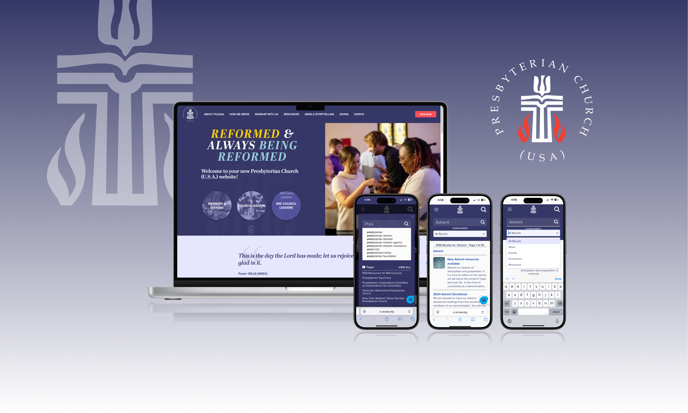
The Presbyterian Church (U.S.A.) operated seven independent websites serving different ministries, audiences, and internal teams. While the initial request focused on consolidating these sites into a single platform, the deeper challenge was systemic. Each site reflected a different set of priorities, assumptions about users, and decision-makers.
The primary risk was not technical complexity. It was fragmentation. Without early alignment, the project was likely to stall, default to compromise, or deliver a unified platform in name only.
Bringing together seven websites and aligning 30+ stakeholders to create a unified experience for 5 user types.
A single, consolidated platform that serves diverse audiences and ministries without sacrificing the distinct needs of each.
An information architecture and design system that provided a consistent foundation while remaining flexible enough to support the distinct needs of different ministries.
The site was recognized as a 2023 Web Excellence Award winner, an external validation of the quality of strategy and execution the project delivered.
_announcement.jpg)
It became clear early that this was not primarily a design or information architecture problem. It was an alignment problem.
Before meaningful design work could begin, the organization needed a shared understanding of who their users were, what success looked like across divisions, and how decisions would be made when priorities conflicted. Without that foundation, speed would increase risk rather than reduce it.
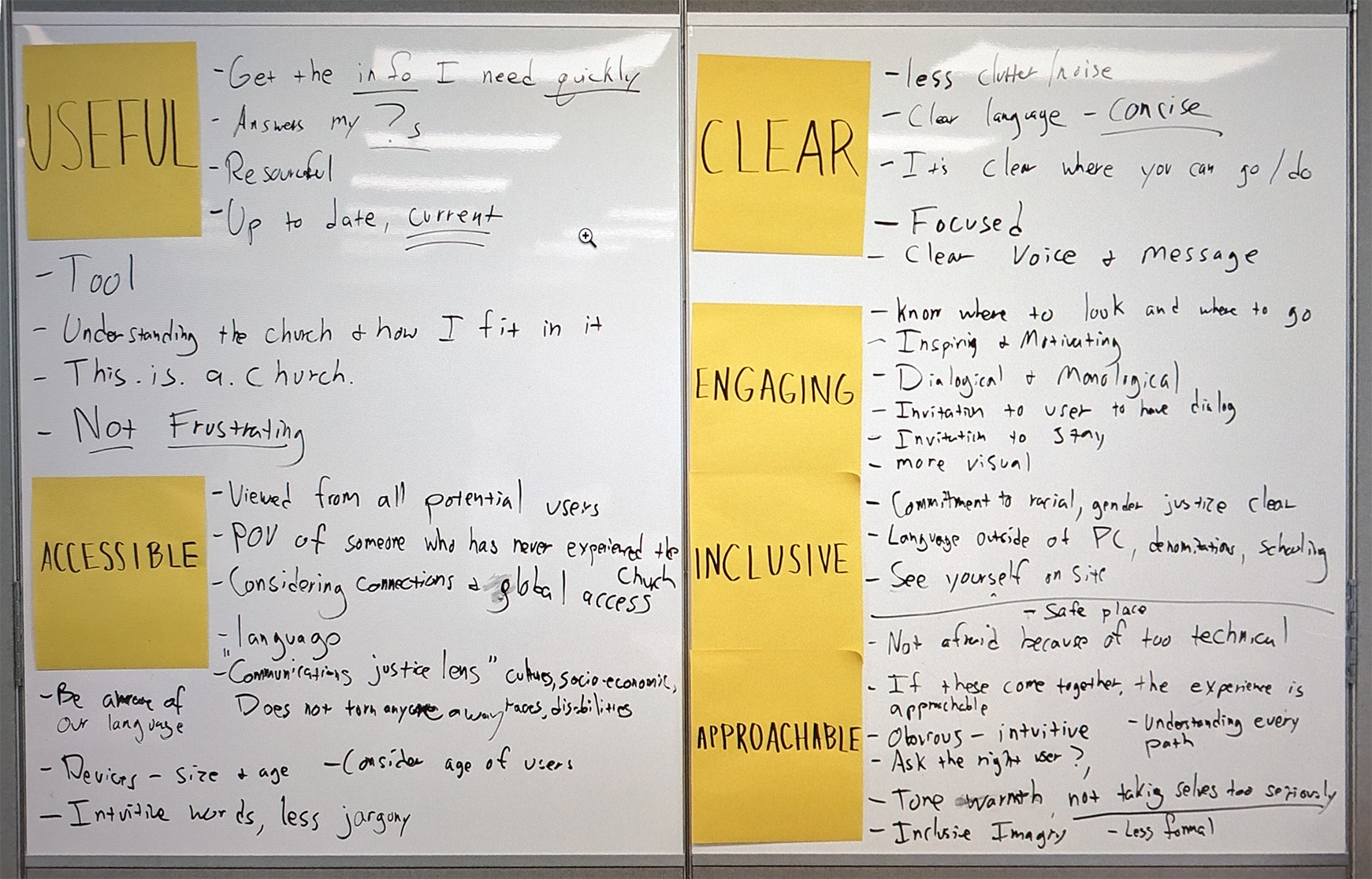
To establish shared direction, I designed and facilitated a full-day kickoff retreat that brought leaders from across previously siloed divisions together. Preparation included a pre-work survey that surfaced internal challenges, priorities, and goals, as well as a collaborative exercise to define a small set of shared experience values that would guide decisions throughout the project.
This work introduced a user-centered decision framework that allowed stakeholders to move from individual advocacy toward collective ownership. It also created early trust, clarity, and buy-in which proved critical as the project progressed.
"The website should have a clean, uncluttered look. The visitor of the site should come away feeling they easily found what they were looking for…with nuggets of information that they weren’t necessarily looking for. They should come away with the thought that visiting this website was a rewarding experience and they want to revisit the site again and again."
The goal of discovery was not simply to gather user insights, but to establish a shared, evidence-based understanding of users across teams that had historically operated independently. Research was framed as a collective learning process that could shift conversations away from opinion and toward observable patterns and needs.
I designed a mixed-methods discovery approach that balanced scale and depth. Quantitative surveys were distributed to thousands of church members and leaders to identify patterns across audiences, followed by qualitative interviews and task-based exercises that explored motivations, frustrations, and mental models.
The insights were synthesized into personas and journey maps that served as practical decision-making tools rather than static deliverables. For an organization where research had not previously guided digital strategy, discovery created a shared reference point that helped teams prioritize and move forward with greater clarity.
Discovery Phase Artifacts
Once alignment and shared understanding were established, the design challenge became clear. The goal was not simply to design a new website, but to create a unified system capable of supporting diverse audiences, complex content needs, and multiple internal teams over time.
Before exploring visual direction, I focused on defining the platform's underlying structure. I led the development of a consolidated information architecture and worked closely with engineering partners to define content types, relationships, and migration strategy so the experience could scale without introducing unnecessary complexity.
With that foundation in place, we developed a flexible design system and visual direction in parallel. Structured collaboration with stakeholders grounded feedback in shared experience principles rather than personal preference, allowing teams to create content independently while maintaining a cohesive and adaptable experience.
Design Phase Artifacts
"The best outcome wasn't a better website. It was a shared understanding of who the website was for, and the confidence to build toward that."