
Case Study · Healthcare · Product Design
UK
HealthCare
Designing clarity and confidence across a large-scale academic healthcare system
Case Study · Healthcare · Product Design
Designing clarity and confidence across a large-scale academic healthcare system
UK HealthCare is a large academic healthcare system encompassing multiple hospitals, clinics, service lines, providers, and conditions. Over time, its website had evolved into a collection of loosely connected hospital and clinic sites that functioned more like independent properties than a cohesive system.
As content and taxonomies expanded, the experience became increasingly difficult for patients and visitors to navigate. Internally, the system was no longer scalable. Small updates often required significant effort, and maintaining consistency across front-end experiences and back-end structures became increasingly fragile.
While the project was framed as a website redesign, the deeper challenge was systemic. Without a clear, scalable structure, the experience would continue to fragment as the organization grew.
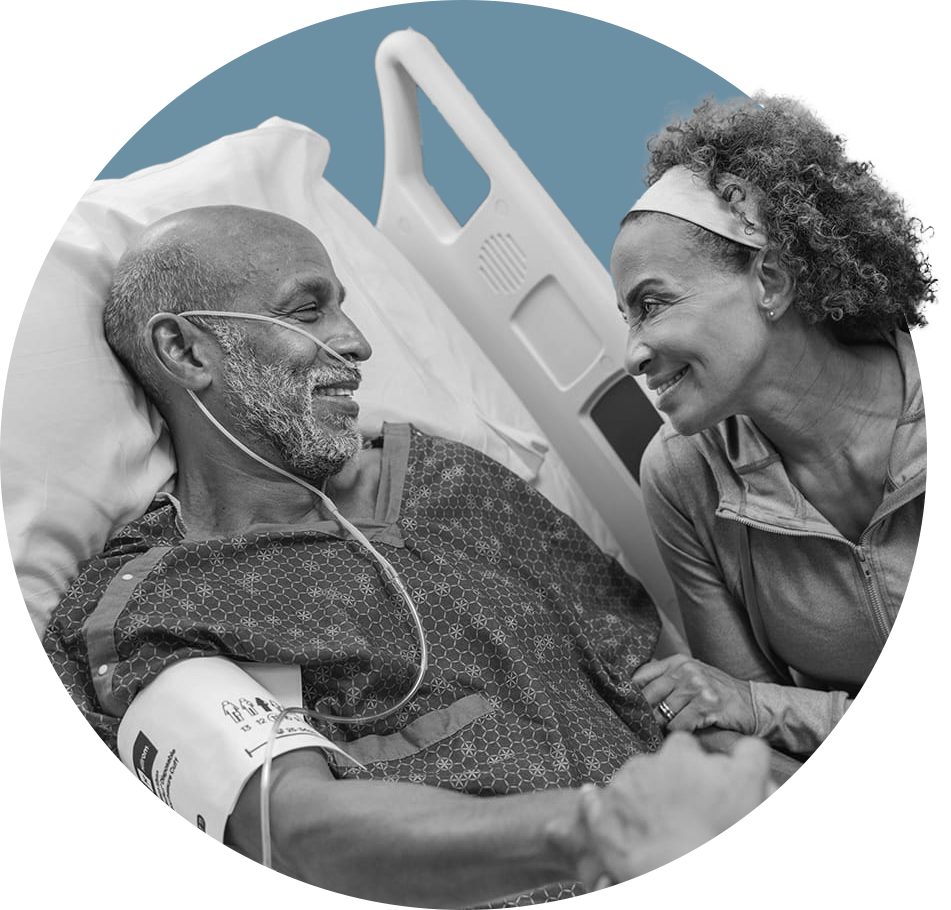
Bringing clarity and confidence to patients navigating a large, fragmented academic healthcare system.
A modern, intuitive platform that brought clarity to a complex healthcare system — letting patients navigate confidently across hospitals, services, and conditions through multiple clear pathways.
Prior to launch, teams regularly fielded internal complaints about usability and content structure. After launch, that feedback largely stopped — a quiet signal that the system had delivered what the organization needed.
The work earned recognition from three industry awards, validating the effectiveness of a patient-centered, system-driven approach applied at scale.
The core challenge was designing a system that could support an enormous amount of content while remaining intuitive for patients and sustainable for internal teams. UK HealthCare needed to balance multiple, often competing demands: patients and visitors seeking clarity and reassurance, multiple hospitals and service lines with overlapping content, decentralized content ownership with limited standardization, and a rigid CMS that made change costly and slow.
Early in the project, discovery revealed that the complexity of site architecture, content relationships, migrations, and taxonomies was significantly greater than initially understood. Rather than moving quickly into execution and reinforcing structural issues, I worked with stakeholders to make a deliberate tradeoff — investing additional time upfront in planning and discovery to ensure the system was designed correctly from the start.
This decision slowed early momentum but reduced downstream risk, rework, and long-term maintenance burden. Without addressing structure, architecture, and governance early, execution would have improved individual pages while reinforcing long-term complexity.
"Given the scope and complexity, my approach centered on one principle: confidence would come from clarity. I treated planning, discovery, and system definition as prerequisites for execution, not steps to rush through."
The goal of discovery was twofold. First, to understand how patients and visitors actually searched for care and information. Second, to surface where the existing system created confusion, uncertainty, or friction.
I designed a mixed-methods discovery approach that combined behavioral data, qualitative research, and system-level analysis. Behavioral data and usability sessions revealed where users became disoriented and lost confidence. Think-aloud testing exposed moments of hesitation and uncertainty, particularly in wayfinding. Card sorting and journey analysis highlighted mismatches between user mental models and existing taxonomies. Internal analysis revealed how content growth and rigid infrastructure amplified complexity.
Across all research, one insight consistently emerged: users needed clear organization and intuitive wayfinding, with multiple paths to information that did not increase cognitive load. These findings directly informed the site's information architecture, navigation strategy, and search experience.
Discovery Phase Artifacts
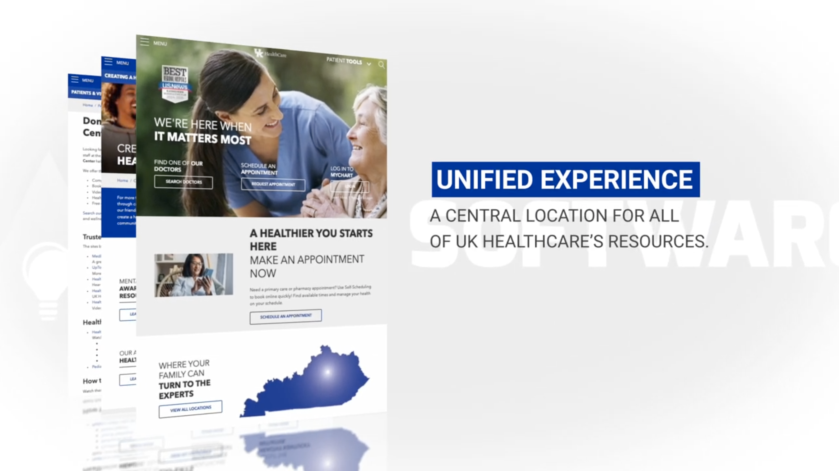
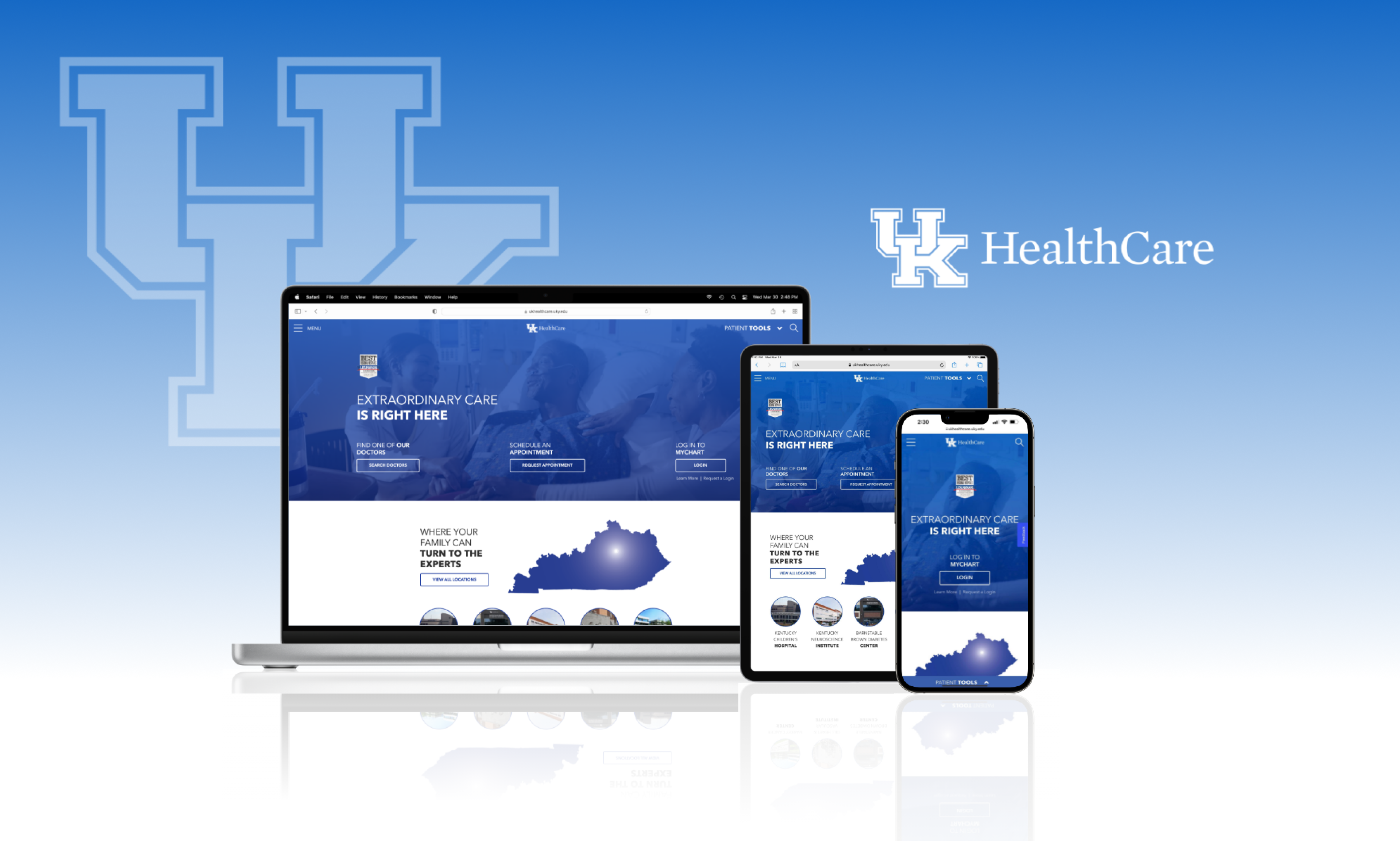
Once research clarified user needs and system constraints, the design challenge became one of structure and scalability. I led the consolidation of multiple hospitals and clinics into a cohesive architecture that balanced shared patterns with necessary flexibility — identifying common content types, relationships, and navigation patterns, then allowing individual hospitals to retain autonomy where needed.
Given the depth of content, navigation needed to orient users, not just move them. I designed a multi-level navigation model that used clear visual hierarchy to distinguish global, section-level, and local navigation. This layered structure made the site's organization immediately legible and helped users maintain a sense of place as they moved deeper into the experience.
Search played a critical role for users arriving with specific goals. I designed a content type–based search experience that grouped results by providers, locations, services, conditions, and articles — allowing users to scan, compare, and refine results quickly without needing to understand the site's underlying organization. For condition and treatment content, structured patient journey patterns organized complex information into progressive, understandable steps, reducing overwhelm while preserving access to detailed information.
Design Phase Artifacts
"The real work wasn't redesigning a website. It was building a system clear enough that patients could find care — and stable enough that teams could sustain it."